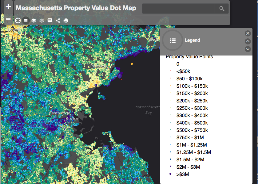
An interactive map with over 2.5 million data points shows a property value visualization of the whole state of Massachusetts.
Created by Aaron Doucett, a GIS analyst in Cambridge, the map consists of individual dots that each represent a land parcel. From each dot you can see, total property value, price per square foot and year built.

The property values are assessed values that are created by the town in order to determine taxes on the property and aren’t actual market values, which could potentially be higher.
The purple and blue dots are the most expensive homes around a million dollars or more, while the green dots are homes near the state median value of $342,900. Red and orange dots are homes below the median value.
The map is just residential properties, but emphasizes distinct pricing zones throughout various areas, especially around different town boundaries.
It is obvious even from a zoomed out view of the map that prices get higher as you get closer to Boston, but that areas such as Cambridge and Brookline are similarly expensive.
Explore the map for yourself here.
Tags: Housing Prices, Map, news, Property Value, Residential Real Estate

